Driver App Redesign
Previous Work

Gojek is a Indonesia’s first unicorn company, that specialises in providing multiple services to the users. Our customers equated a better life with a sense of progression. They valued short-cuts aka hacks that solve for urgency or inefficiency in their daily chores, helping them focus on more important things. And our driver partners played the role of daily hacks in their lives.
Role in this project
-
Lead the project
-
Facilitate IA Workshop, Design sprint
-
Pitch to the Product team
-
Product Design
More than 1,000,000 driver partners collectively cover an average distance of 16.5 million kilometers each day, making Gojek Indonesia’s de facto transportation partner. 8 out of 10 drivers said that Gojek is their sole source of income - they’re highly dependent on Gojek.
Now, we want to give back to our driver partners who always been there for our customers. This redesign project is one of the initiative that drives from our observation that drivers no longer use our app for simply accepting order. But, they relay on this app to make a living.
The creation of this project is a labor of love from a lot of teams in Gojek and Driver Platform - Design, Research, Business, Regional, Product, Motion Design, Illustrators, Copywriters and many other teams who compassionately collaborate until our ideas can be actualize by Q3 this year (2021).
🔍 Why are we doing this?
1. Evolving platform
As companies expand, products will inevitably change and evolve overtime. The design needs to enable the product to grow. However, we found that the navigation is no longer scalable as we keep adding new features and make our hamburger menu excessively long, unclear on what to add in homescreen also bound to make homescreen get scattered.
2. Evolving behavior
For our driver partners, our platform has evolved from just taking trips to managing their own finances. We also going to use this opportunity to revisit our homescreen and analyze drivers' behavior, make sure to optimize their evolving needs. We are hoping by giving them a more intuitive categorization, it would result in faster task discovery and completion.
How does success look like?
The core problem that we want to solve in tthis project is the left-side drawer that getting longer will make drivers take longer to find a feature, because they need to skim all the menus.
Other than that, we also find drivers need to go back and forth to check features such as wallet balance and income summary simultaneously.
So, we can say objective of the study :
-
Summative evaluation - to know how well a design performs, [compared to a prior version] and getting the big picture and assessing the overall satisfaction of a finished product.
-
Evaluate the efficiency of navigation, to ensure drivers can find and perform tasks easily.
Success metrics
Our main metrics are DSAT within 30 days after 100% release with the score more than 4.0 (benchmarking from our monthly DSAT in H1 with median 3.75, we hypothesize Redesign DSAT will be higher because monthly DSAT consist more variables).
Eventhough ease of navigation is the main issue that we want to tackle, however it's tricky to measure the task completion/time without having a controlled condition (we did tracked them in UT). Therefore, for the first milestone we only monitor several metrics such as visits to several menus that drivers view in daily basis*
*We called these menus Top tasks - tasks that drivers should be able to achieve using the design to be considered a success.
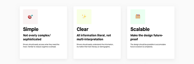
Design Principles
These are the things that we need to consider and stick with :

🛠 How is the design process?
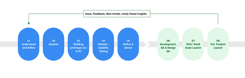
01 Understand and define
We know the importance of doing the redesign, but before we get started, we need to have strong foundation of drivers' current behavior, and define any needs or pain point that we can cover in this redesign.
Therefore in. this first stage we have :
-
Survey, to learn the most frequently visited screen in each journey and the difficulties that they are encounter. Later, the feature will become the base for Top Tasks.
-
Competitive Benchmarking, to learn feature parity.
Survey

Competitive Benchmarking
Several benefit of competitive benchmarking :
-
Getting an entire industry view, how our competitor does things
-
Learn what doesn’t work for competitor, ensure to not repeating their mistakes
-
Give us insight into whether a competitor’s new feature is worth replicating or ignoring.
We learned how our competitor's Driver App look like, especially for their navigation and homescreen. Interestiigly, our competitor already provide most of our drivers' requested feature in above survey (i.e. Take Me Home/GTPD feature, weather or traffic light. in map).
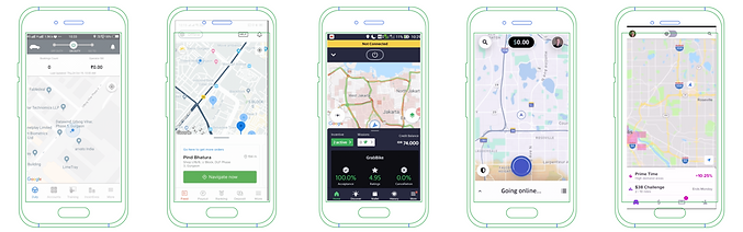

By far, we have similar problems with Uber before they decided to redesign their driver apps. Although we haven’t gotten to the point where the buttons are scattered on the homescreen, we did put everything on the left side drawer and make it longer each day.
We'll use the potential feature that we gathered in the Design Sprint - Concept Sketching session.
Potential feature :
-
Notification, one of three solution of inbox
-
Nearby restaurant in horizontal shuffle
-
Traffic light
-
Connection status ticker
-
Map settings
-
Status at glance
-
Shuffle as dashboard
02 Ideation
Since the project is initiated by Driver Design and Research team, we have to get buy-in from the Product and Business team. To do that we held a pitch meeting and present the mock-up : "How the design may look like if we use all the feature request from our drivers."
After we got t he buy-in we separate the ideation into 2 parts :
-
Information Architecture Workshop, participated by all driver team stakeholders
-
Design Sprint - Concept Sketching participated by Driver Designers
Pitch meeting
How the redesign may look like
Weather forecast
Auuto. Hygiene Check :
GPS accuracy
Memory/RAM
Internet strength
Message shortcut
Traffic light
Hygiene check shortcut
Map setting
Information Architecture Workshop
1st Session - Offline workshop
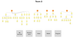


1st workshop was attended by Designers and Researchers; all 12 participants they were divided into 3 teams and were asked to create their own IA.
Next step is to find the pattern between these categories. Finding pattern is important because it means that most of participants agreed to classify the information into particular cluster, means that most have similar expectation on how to find those particular information.
From all of this cluster we can already see the pattern. All team classified into these 3 categories
-
Profile - account - profile/settings
-
Money related / earnings / wallet
-
Program/swadaya
Then we also decided to grouped Help and inbox inside Profile/Account/Settings
After we have agreed on the 4 main categories, the sub-categories and the cards inside each group naturally followed.
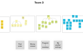
2nd Session - Online workshop
2nd session is trickier to conduct because we have to do it online and everyone's voice should be included fairly. Therefore, we use Optimal Sort to do tree testing. To generate Cluster , the common group, and the Label - similar component like 1st session result, we follow these steps :

Among many visualization tool that Optimal Sort offer, we use :

We have another discussion after showcased both result. Finally we decided to have 4 main categories:
Earnings
Place where drivers can monitor all their income, including. their balance
Marketplace
Drivers can see all 3rd party offers and vouchers to help reduce their daily expense
Inbox
The place for all communication
Profile
Settings, Help and Loyalty Program to make drivers feel recognize
Design Sprint - Concept Sketching
How to convert IA to sketch
Now that we have the IA, next thing to do is to create a multitude of potential solutions to our challenge, by conducting Design Sprint in 4 days for each category :
Homescreen, Wallet, Marketplace, and Account - The participants are designers, however researchers and other stakeholders are welcome to join the showcase, give feedback and vote.
Different from the usual Design Sprint, we didn’t create the sketch using Crazy 8, rather we want the participant to have in-depth understanding towards the screen and more feasible ideas. Therefore, we are encouraging the participant to have reference and do the concept sketching during offline.

03 Building the prototype
Low Fidelity
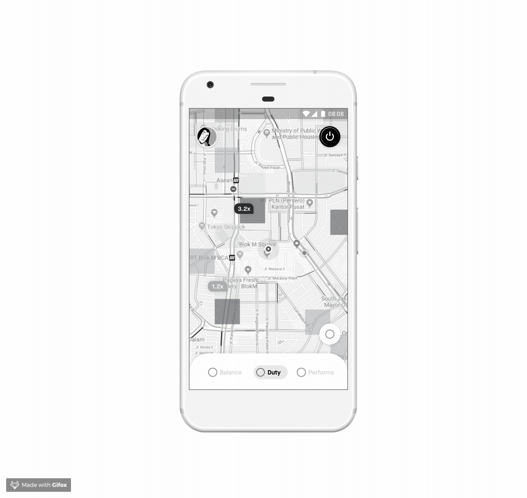
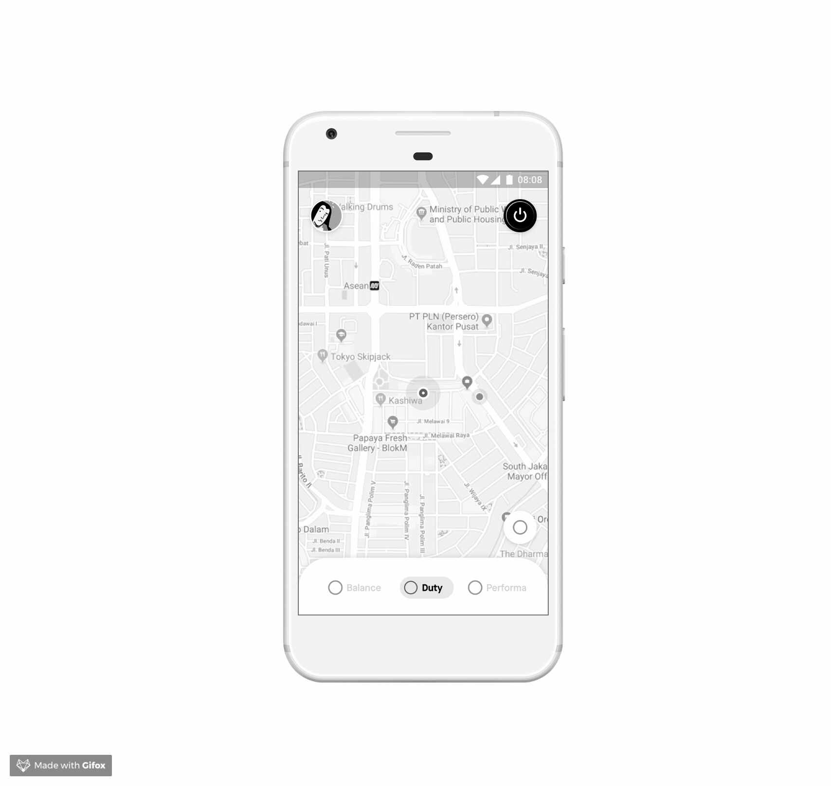
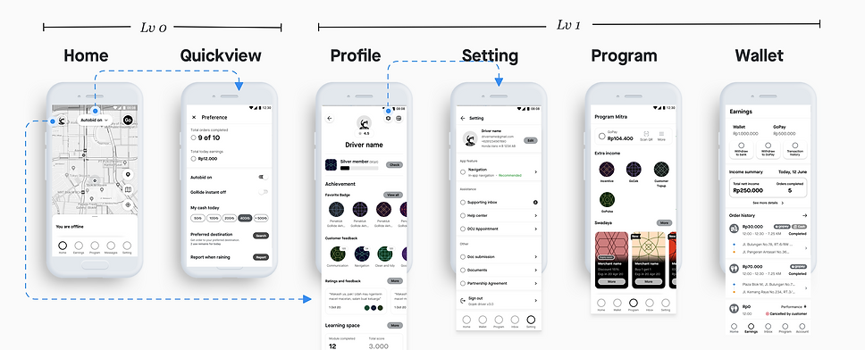
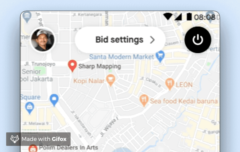
🏠 Homescreen


Drawer is our current homescreen main navigation where the driver can access more features. The other important component is the Activate button, that allows the driver to go online and take orders. When they tap on the Activate button, they will see the Quickview, this screen enables them to set order preferences and see their today performance overview.
The common pain point that drivers often expressed is the Inactivate button, whereas they need an additional step to go offline and the bid would frequently come before they reach the Inactivate button. It forces them to proceed the order or cancel and impact their performance.
Our aim in designing the homescreen are :
-
To give visibility regarding their status, performance, location, and what are the opportunities around their current area
-
To motivate them and keep them feeling productive
-
To inform progress and feedback
-
To provide result and celebrate their achievements
We want to optimize this objective by providing the relevant context in the right time. Hence, the idea is to make the content of shuffle dynamic, depending on drivers’ online/offline state.
Result : All screens
Option 1

Option 2
High Fidelity
Option 1
Option 2
04 Validate/Usability Testing
Field Research Phase 1

1st phase UT is a formative usability study, with these objective :
-
Comparing option A/B, we would like to evaluate the pro and cons of each option
-
Evaluating navigation and/or information architecture. We’d like to know how the changes of the navigation structure affect the users’ wayfinding accuracy.
We use both above design as prototype.
*In order to avoid halo effect, where participant choose the latest design that was given to them, we rotate which design we show first. One group get design A first then design B and vice versa and one group only do usability testing for one design.
Participants = 2W 136, 4W 109 - 2 design - 2 cohort - 7 cities
Cohort = Age/Tech literacy (21-35, 36-50)
We use a high number of user to ensure normal distribution among user since in there is a minimal number of user (20 user) per cohort to be considered as statistically significant
Result and Insight

After completing the UT, we asked participants : Which tasks are. the most challenging for them. For both design A and B, top 4 most difficult task for drivers are: Read rating and comments, search incentives scheme, wallet/ transaction, and order history
The answers consistent with the lowest success rate which are Order History, Incentives, Wallet, followed by Ratings.
Homescreen

a. On bid
-
Most driver like design A because of the use of Gojek logo as on/off button as they perceived it is as “iconic”, plus they already familiar with the button position (similar to current driver app)
-
Even though driver think the color change from black to green to inform their status in design A is enough, they think offline / online copy in design B provide more clearer status feedback but the toggle in design B is considered too small for some drivers, especially the older drivers.
-
In term of usability score, drivers can easily find the on/off button in design A with 87.70% direct success for 2W and 86.50% direct success for 4W compare to design B with 72.70% direct success for 2W and 57.90% direct success for 4W
-
Overall, they give suggestion to add sound or haptic feedback as they change their status because they’re afraid they’ll accidentally swipe their status when they put their phone on their pocket

b. Message
-
Most drivers prefer design A with message icon and the “pesan” copy to amplify the visual cue, however there are some drivers who think that message is not that important to have their own section on bar menu
-
Most driver have difficulties to find message in design B because:
-
They didn’t aware of the button on top right
-
The bell icon is not familiar and they associate it more to notification rather than a message
-
-
In term of usability score, drivers can easily find message in design A with 52.70% direct success for 2W and 63.50% direct success for 4W compare to design B with 27.60% direct success for 2W and 33.30% direct success for 4W

Shuffle
We use shuffle to provide shortcut to important feature and as one of communication channel. We also hoping, shuffle can help drivers feel more ready before going to work, with the encouragement (c) and the incentive scheme info, and feel productive when wait for bid, with exploring other opportunity (d)
a. All drivers like the clear instruction “swipe up to read more” in design B, it gives clear cues that the shuffle card is draggable
b. Most drivers like daily order recap in design B. They think it will make it easier for them to see their daily recap. But they preferred the information to be a little bit hidden (like put in on the bottom) because it is personal information.
c. Most drivers think the green area in design A is too big, but they like to. have their name on it.
d. Some drivers perceived layout in design B is neater than design A, maybe because design A contain too many pictures. Drivers think too many pictures in design A will cause heavier app performance and high data consumptions.

Account
-
We found that almost all drivers have difficulties in finding customer rating. Most of them are surprised that they can check rating from profile since some drivers explain that rating come from customer or related to order, not their identity.
-
The difference between design A and B is only the placement of the profile button, but once drivers inside profile page, there was no difference between two design.
-
According to drivers, finding customer rating and comments become one of the top 5 most difficult task to finish. Design A have 34.50% direct success rate for 2W and 19.20% direct success rate for 4W, meanwhile Design B have 5.30% direct success rate for both 2W and 4W.

Earnings
-
The copy “Transaction History” in design A help drivers identify the purpose of the icon compare to design B that only say “buka” to open the wallet
-
Aside from the task to search for transaction history, driver like design A because the button to withdraw to bank and gopay is located in L1, meanwhile in design B you have to click to wallet detail first to see the withdraw button
-
Drivers appreciate the clear distinction between driver wallet and gopay in design B, but there’s too many clicks to get the information that they need. For example, it will cause a hassle for driver to find withdraw feature (double layer)
-
In general, drivers preferred design A because the layout is almost similar with the current driver app so it was easier to understand, Beside that design A put preview of their order history up front.
Field Research Phase 2
In this research, we only do usability testing on the most difficult task according to drivers from previous research:
-
Search Order History
-
Search Transaction History
-
Search Registered Vehicle
-
Read Rating and Comments from Customer
-
Check Today’s Incentives Scheme
-
Search Swadaya Voucher
We only have 1 design, the iteration made based on previous UT. We invited one participant from each city whom participated the 1st phase, the reason is because we want to understand the improvement of this design.
N = 8 for 2W, 8 for 4W
Result and Insight
-
There are tasks who have significant lower score (1) Incentive, and (2) Ratings.
-
All drivers like the change that happen in homepage and shuffle card, for them the information in shuffle card already contain just important message.
-
Drivers prefer the transaction list icon to be grouped with withdraw icon rather than in separate section.
-
Drivers associate customer rating and comments with order history and not profile page, this may because in old design ratings was inside incentive menu.
-
Driver is okay with the separation of driver wallet and gopay in two different page and understand the difference between wallet, today’s earning, and gopay in earning & swadaya page.

Homescreen
-
All drivers like the logo and online button
-
Based on drivers responses, we concluded that the emergency button is ambiguous
-
Some drivers think its a cue when bid is coming
-
Some drivers think it’s look like notification button
-
-
There are some drivers who understand the icon is emergency button since it’s similar to ambulance sirens. Even for those who understand, they still think the button is to report customer related issue.
-
All drivers like the marking icon. In previous iteration we use vehicle and it’s covering the map

Shuffle
-
Incentives remains the most important information in shuffle, therefore they like the layout as we put information of target point and shortcut at the beginning.
-
Half of drivers show interest towards smart tips, but they still think we can make the it more concise (shorter scrolling). Drivers are wondering what is the meaning of modules that displayed here?

Earnings
There are two path that drivers think the location of transaction history is:
-
“See Detail” button, and
-
Order history
Maybe because in this page there are more than 1 CTA / action / information, so drivers still figure out which one is directed to where
-
From previous research, we give suggestion to reuse design A layout, because in qualitative findings drivers prefer design A is perceived neater. Beside that, there was a fundamental changes in incentives scheme location, previously it was located under program, now it is located under earning.
-
Most drivers think that the separation of driver’s wallet and gopay is clear (due to it’s different purpose), and some of them think it’s good to separate those two because in old design, sometimes they misread so they don’t realize when their wallet is minus
Account
-
The presence of drivers tier and rating is motivating drivers to work harder
-
Based on previous experience, driver look for rating not in profile page but in order history. However, there is no issue findings rating once drivers get into profile page. After this UT, we have moved the Ratings as separate menu so that once the redesign has released, drivers no longer associate them with order history.
05 Refine and deliver

All screens after iteration
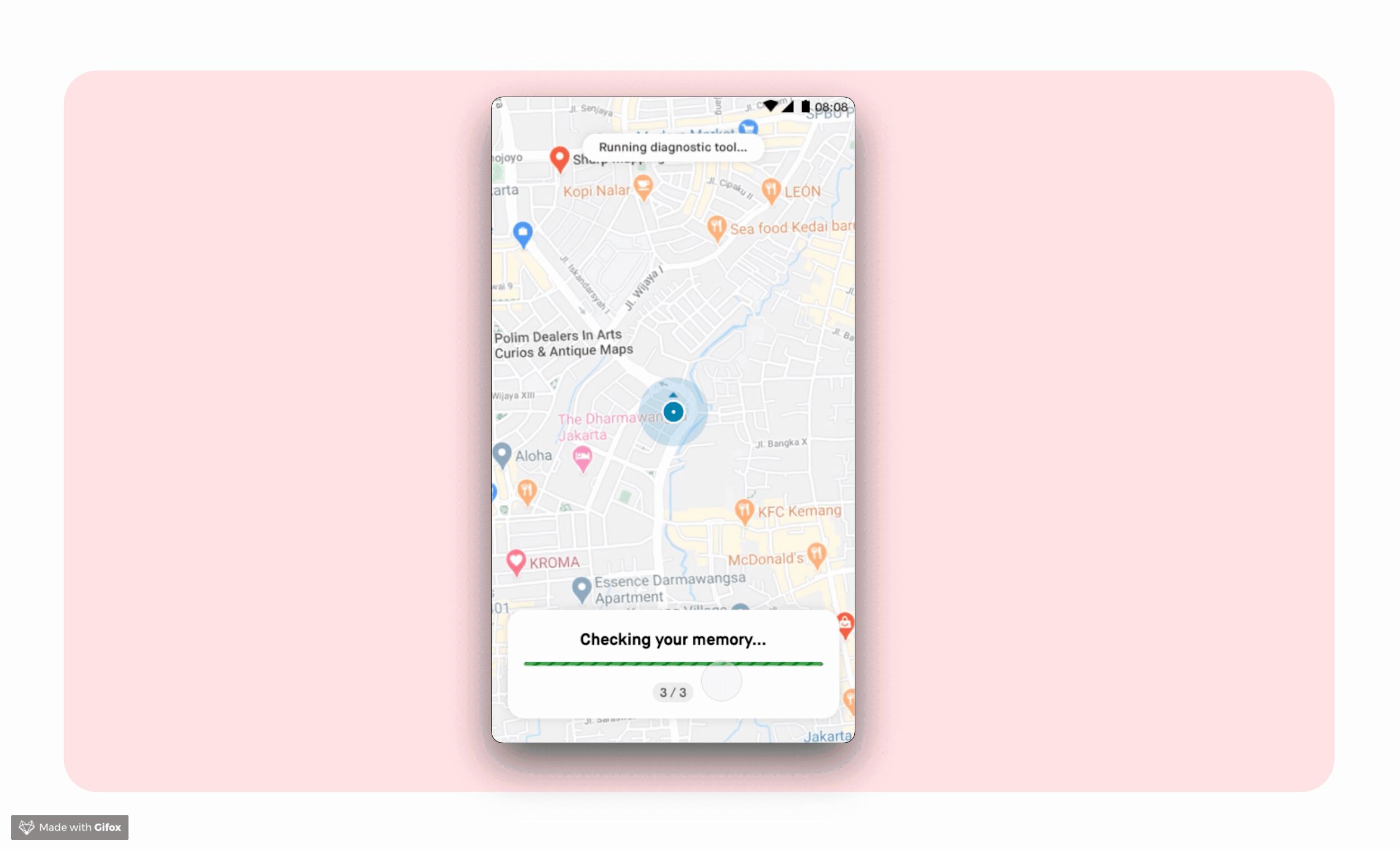
Auto Diagnostic Tool
We first find out drivers’ habits to check their health’s app in 2017 Drivers’ Ethnographic research. In this research, before opening the apps driver has a ritual to clear cache, and check GPS accuracy.
This insight comes up again when we conduct 1st KonMari research. All drivers have a similar goal which is to make sure their GoPartner app is ready to work, no error, and accurate. They will check :
-
GPS Accuracy - Check whether the pin location is correct or not
-
Bug - Check if a (or some) part in the app is blank (e.g. profile picture)
-
Internet connection / quota - Check if the loading process is too long or not
Similar with Driver’s Ethnographic research insight, drivers believe these 3 steps are connected to order allocation.
Several related insights :
-
All drivers like the idea of auto-diagnostics after log-in because it feels more practical and feels helped as if it had been checked by Gojek automatically.
-
Most drivers said they will use this feature in the morning before they start working.
-
Some drivers said they will also use it if they don't get an order.
-
Some others will rarely use this feature IF they are sure that they DON’T have issues with their device and account.
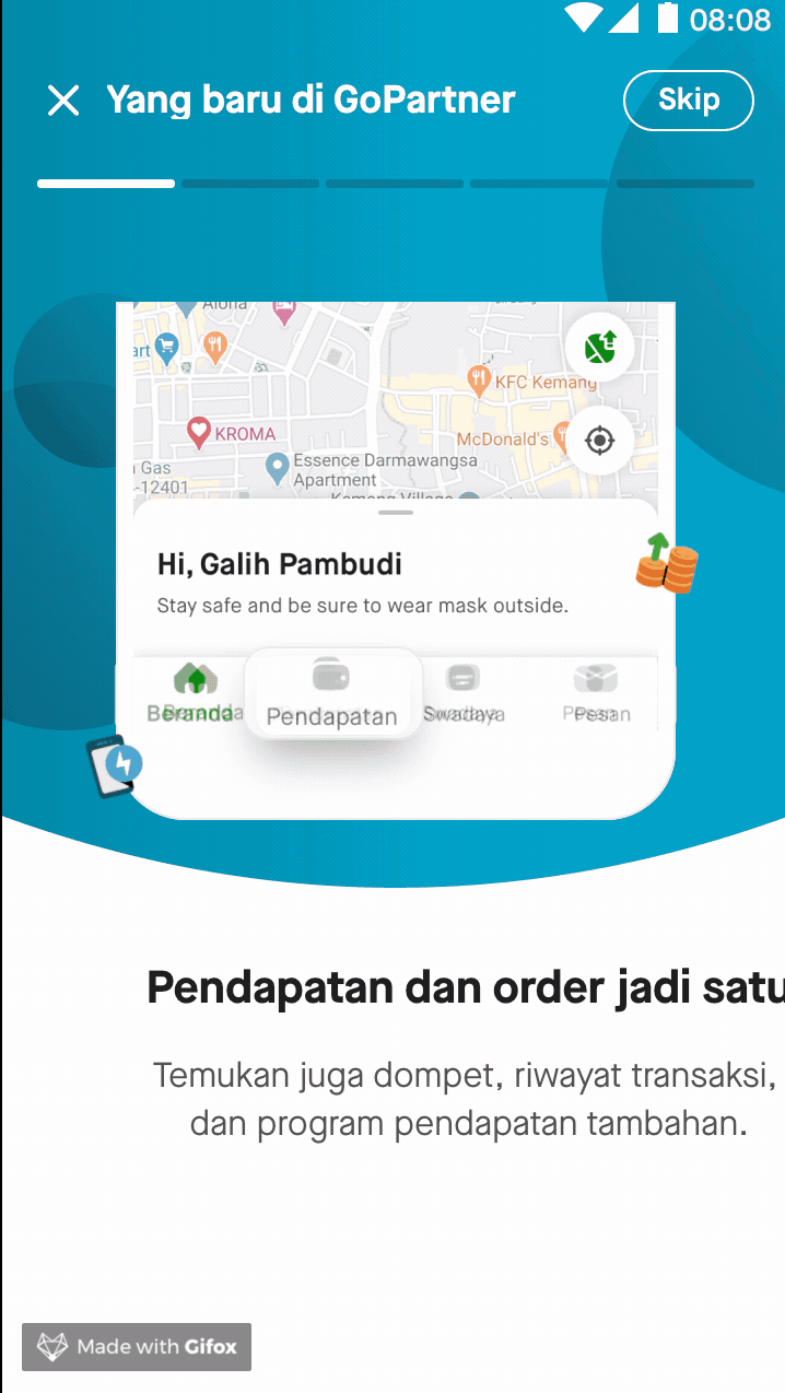
Walkthrough
Drivers will see the walkthrough to onboard them on what's change in this redesign.
One-step to go offline
One of the pain point that we often found is the 2 steps to go offline. In old design, when drivers just about to going offline to take a break, sometimes another bid is coming and drivers force to take them because afraid his performance get compromised if he canceled.
After redesign, we eliminate the additional step, add the microinteraction when it's online/offline, and add haptic feedback everytime drivers tap to going online or offline.
06 Impact Analysis
Satisfaction score


Overall Satisfaction
Indonesia
Improvement of 1% for 2W and 4% for 4W.
Singapore
Improvement of 20%.

Ease to discover feature/menu
Indonesia
Improvement of 2% for 4W.
Singapore
Improvement of 9%

Information Architecture
Indonesia
Improvement of 2% for 2W and 3% for 4W.
Singapore
Improvement of 12%
Drivers' Feedback
